Easy Budget
Personal Saving App UX Case Study
Project Overview
In an era where financial stability is a growing concern, many individuals struggle with saving money effectively. To address this challenge, I designed and developed a Personal Saving App that helps users track their expenses, set savings goals, and build better financial habits through AI-driven insights and gamification.
Problem Statement
Many people find it difficult to save money consistently due to a lack of financial awareness, impulse spending, and the absence of structured savings plans. Traditional banking apps provide transaction history but fail to engage users with proactive saving strategies.
MY ROLE
UX Research
UX Design
UI design
Usability Testing
PROCESS
Discovery & Research
Define
Ideation & Concept Development
Design
TOOLS
Google Forms
Excell
Figma
Miro

Research & Discovery
User Research
To better understand user pain points, I conducted:
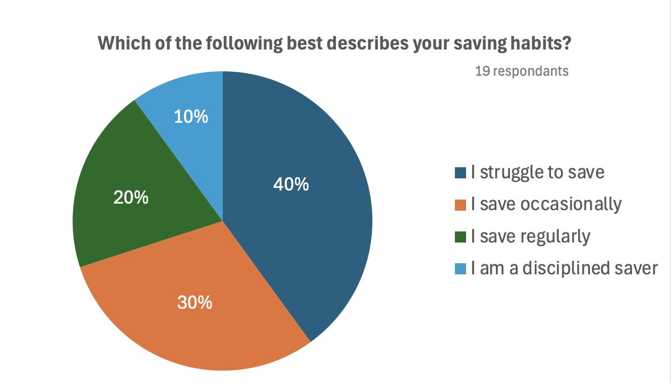
Surveys & Interviews: 19 respondents shared insights on their savings challenges.


Competitive Analysis: Evaluated existing financial apps like WeMoney, Beem, and Raiz to identify gaps
Key Takeaways:
70% of users admitted to struggling with impulse spending.
75% desired an easy way to automate savings.
50% lacked clear visibility into their financial habits.
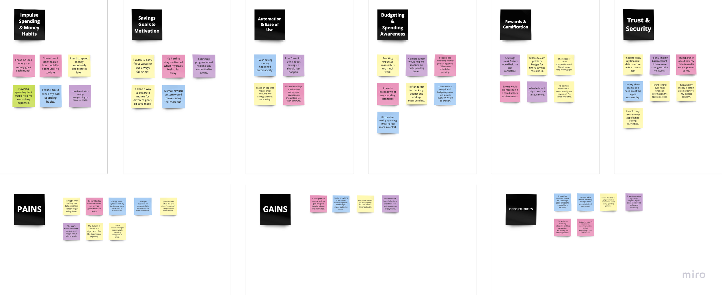
Synthesising
Affinity Maps
After conducting user interviews, on the Miro board, all the participants' responses were synthesised to discover the keywords and identify the main features that our app could focus on.
HOW MIGHT WE'S
Reflecting on the research, I was able to identify the most consistent pain points and determine which problems were of priority in order to come up with solutions that alleviate their struggles. The problem statements are as follows.
How might we...
Help users manage impulse spending to stay on track with their savings goals?
Create personalized financial recommendations that feel intuitive and actionable to users with varying levels of financial knowledge?
Make saving money feel more rewarding and engaging through gamification and milestone tracking?
Simplify complex financial concepts to ensure all users, regardless of background, feel confident in their saving decisions?
Ideation
Focusing on the HMW problem statements, I started sketching screens to exploring ideas about potential solutions that could effectively help users’ problems.

mind mapping

brain storming
User Stories
Building user stories allowed me to solidify the users’ desired functionalities and articulate the value it brings users. The process of categorising it by priority gave me a clear direction of the key features that must be incorporated.
As a user, I want to…
Set up automated savings rules (e.g., round-up savings or percentage-based deposits) so that I can effortlessly save money without thinking about it.
set personalized savings goals (e.g., vacation fund, emergency savings) and track my progress, so I can stay motivated and achieve my financial objectives.
receive financial insights that analyze my spending habits and suggest ways to save more, so I can improve my financial health.
I want my transactions to be automatically categorized into groups (e.g., groceries, entertainment), so I can easily understand where my money is going.
I want to earn rewards and badges for consistent saving behaviors, so I can feel motivated to save more and celebrate my achievements.
I want personalized saving insights based on my spending behavior, so I can make more informed decisions about my finances.
I want to receive financial education tips within the app to improve my understanding of financial concepts and better manage my money.
I want to automatically save for an emergency fund, so I can feel more secure in case of unexpected expenses.
I want to receive push notifications and reminders about my savings goals, spending limits, and financial tips, so I can stay on track.
Information Architecture
To facilitate the key features narrowed down from user stories, I made sure that I architect the information I wish to deliver to users in a way that is not overwhelming with unnecessary complexity. Establishing a site map allowed me to visualise the overall architecture and organisation of information and the flow of the information and to come up with ideas on how to improve the experience of my users and optimise it.

User Flows
Based on the organisation of information created on the site map, the three main red routes were generated focusing on the main pains and gains. Visualising how users would navigate the app ensured that the pathways are designed to include different kinds of people and are easily accessible to enable users to achieve their goals.
User Journey: Setting Up and Managing Savings Goals


Wireframes
The design stage began by transforming the sketches into mid-fidelity wireframes using Figma. This step of my project opened my eyes to the layouts in the interface and gave me a better understanding of the UI elements, such as visual hierarchy and the placement of various functions on the screen. My main focus on the wireframes was to make the UI elements, such as icons and buttons, simple but detailed and consistent.

Sketches
To facilitate the user flows on the screen, sketches were drawn. This process focused on creating the optimal interface that meets users’ needs and wants. My primary objective here was to ensure the interface is well-organised, easy, accessible, and enjoyable.
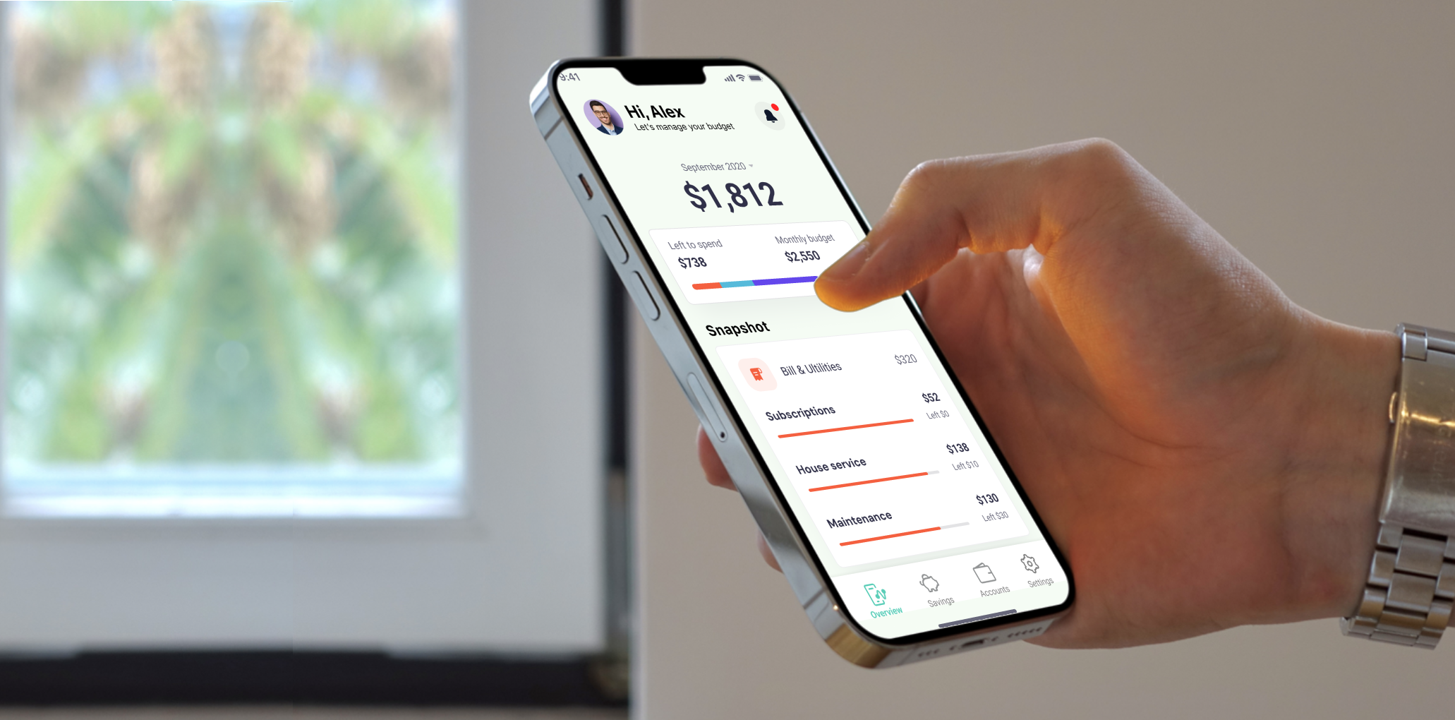
High Fidelity
With the style guide in place, it was integrated into the wireframe. My primary objective here was to create an interface that is easy and simple to navigate but also joyful, which was executed by considering the hierarchy of information and incorporating the style guide and illustrations
Reflection
This project deepened my understanding of good design principles and practices, particularly in how design serves as a form of communication with users. I found the user experience research phase especially insightful, as it allowed me to hear firsthand about users’ motivations, challenges, and behaviours.
One of my key takeaways is that effective design is rooted in understanding users’ needs and expectations. By actively listening to users, I was able to craft a more intuitive and meaningful experience.
Above all, I truly enjoyed every phase of this project, from research and ideation to prototyping and final execution. Seeing Easy Budget come to life has been an incredibly rewarding experience, and I’m proud of the final outcome.