
ASIC Connect
A personal project to redesign the ASIC Connect webpage
Introduction
The Australian Securities and Investments Commission (ASIC) is Australia's financial markets conduct regulator. ASIC is responsible for promoting a fair, transparent and efficient financial system for all.
ASIC Connect is an online service that interacts with ASIC's registers. Services available on ASIC Connect include searching for companies and business names and registering a business name.
First developed in 1991, the website had minimal ongoing UI development for many years. As a result, the website no longer meets the latest design standards and fails to deliver an optimal user experience in line with best practices.
It is modernising the appearance and functionality of a decade-old website for internal and external users.

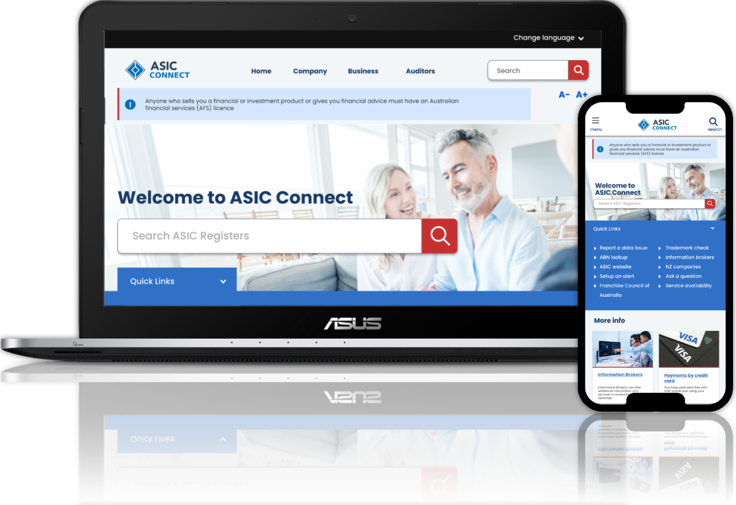
Current ASIC Connect webpage
Understanding the Problem
As part of the initial project kickoff, I worked on a process to understand and visualise the issues of the existing website. I conducted a page analysis from various aspects, including heuristics, information architecture (IA), and content.
The intended audience would be the project team, project managers and business analysts in understanding the scope and timelines.
The main issues identified were:
low usability due to the UI
accessibility issues
lack of responsiveness
poor navigation.
Method: UX discovery + Heuristic evaluation + IA analysis

An outdated experience, characterised by limited functionality and unappealing user interfaces, diminishing the currency and credibility of the website.
Information is not organised in the most intuitive way and poor navigation causes problems in wayfinding, making it difficult to retrieve information.
Inconsistencies in colours and typography, resulting in low accessibility and failure to meet some WCAG guidelines.
Triangulation
I triangulated primary, secondary and tertiary data, along with best practices throughout the design process to help me determine what to keep, remove or relocate.

Simplifying the Experience
The iterated design presents a simplified look achieved by repeated UI elements, and giving a stricter hierarchy to the UI
Less is more.
The key approach to modernising the interfaces is to reduce noise by removing features that are not being used and are not critical to users. Retiring some of the features was a bold move, but a logical move supported by strong user insights and analytics


In conclusion
Redesigning the ASIC Connect webpage was both an exciting and rewarding experience. It allowed me to fully demonstrate my UX and UI design skills. This project highlights my ability to balance user needs with business goals, apply strategic thinking to design. I hope it serves as a strong example of my capabilities and approach, offering prospective employers a clear insight into the value I can bring to their design projects.

With more than 20 years of hands-on project experience, Derek has developed into a highly skilled UX professional.
To explore his project case studies or learn more about his work, visit his portfolio at derekcarruthers.net